Most people start a blog with a top five of films, games or albums. Me? I like to be different!
If I had to give a reason for starting this blog in the first place, it was mostly so I could write and explore video game user interfaces. Primarily as a way to research game UI and explore my interests with it, but also as a potential help to anyone else who might be interested in the area.
As an introductory post (of sorts) into the subject, what better way than to start than with a top five of game interfaces? Now, in particular, I’m focusing on games that are a few years older, otherwise you’d be seeing a list of games overshadowed by Persona5 (which WILL be getting a dedicated post, don’t you worry!). These are games that have made an impact for me over the years.
Let us begin, with…
Dead Space
It’s 2am. All the lights are off. You’re stealthily making your way through the empty husk of a mining ship. A red light glows along your spine. Your trigger finger is itching, but one misplaced shot could see you skewered by a Necromorph.
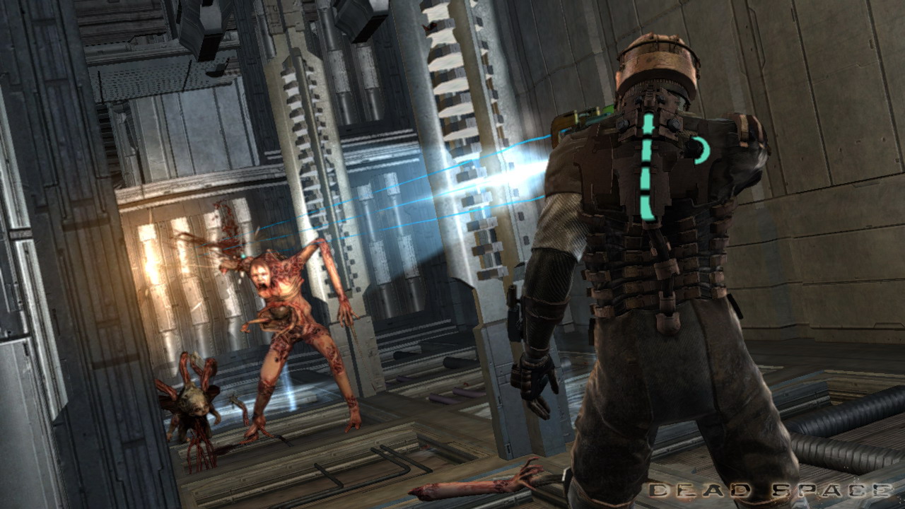
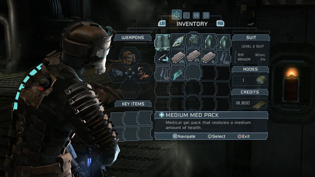
This was one of the first games where I found myself constantly impressed by the UI. Dead Space keeps everything diegetic. The screen is clutter free, and all necessary information not only shares center stage with protagonist Isaac, but is part of the game world. It’s as pivotal to the experience as the gameplay and story.
Remaining health lights up along Isaac’s spine. Ammunition rounds are projected from Isaac’s weapon. The main menu is holographically projected from Isaac’s chest, in front of his face. In a survival horror game, that makes a huge difference. The player loses the comfort of hitting pause at a jump scare - open your menu in Dead Space, you’re likely going to find your head taken off.
One of my favourite interactions? Being able to tap a button and see a holographic route-map projected along the ground in front of you was pretty damn cool (I didn’t spam that tool when I first got it, honest). And also a lot nicer than a floating waypoint in the middle of the screen.
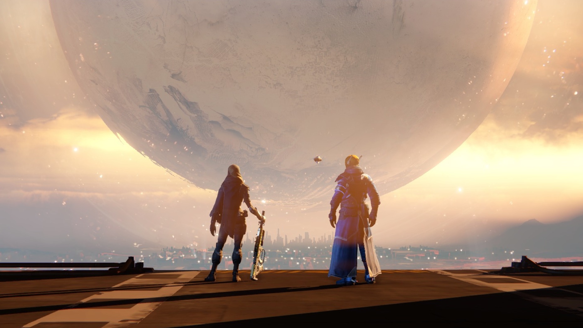
Destiny
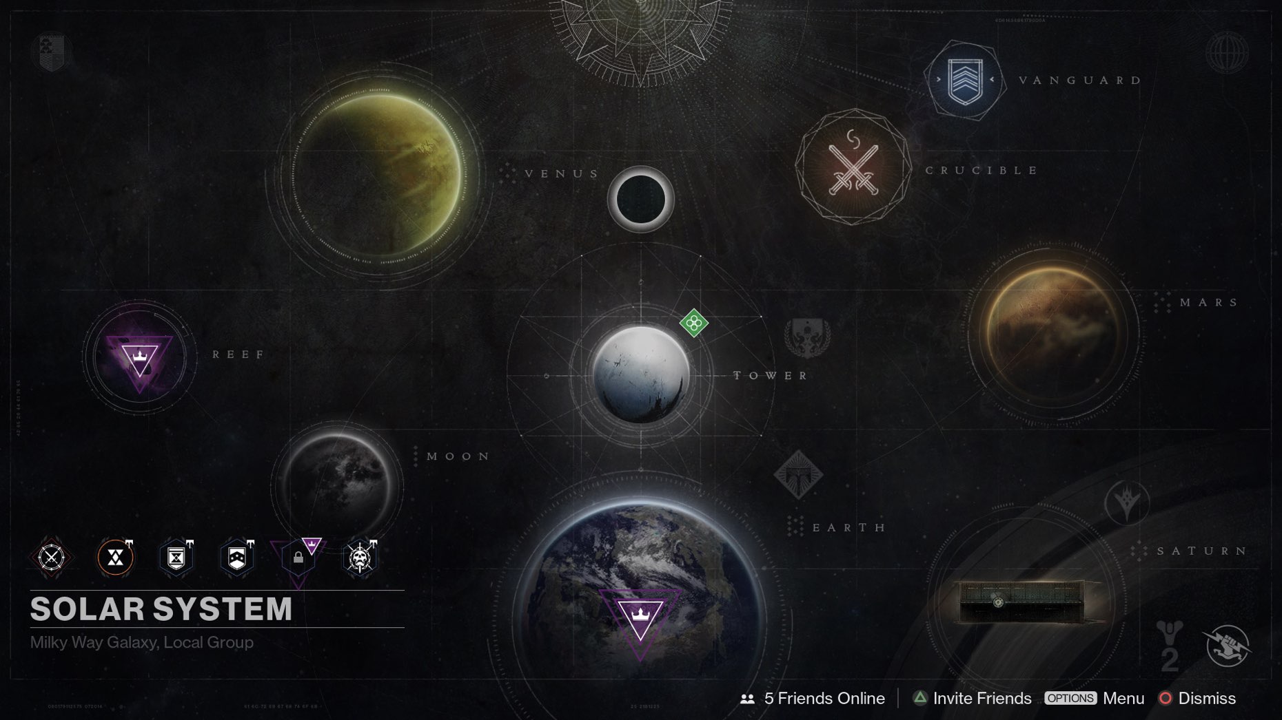
For an console-based first person shooter, I think I can safely say Destiny provides a very different experience to the norm. Say goodbye to endless menus to navigate, and say hello to a cursor… on a console. It works surprisingly well! AND it doesn’t feel awkward to use, which is a small marvel of engineering in itself.
Let’s look at an example interaction. I want to change my Primary Weapon to an Exotic I just acquired in a raid. In a more traditional UI, I would press a button to pull up a menu. I then navigate to an Equipment screed. Click. I navigate to a screen showing all of my weapons. Click. I scroll through each weapon in there (or filter, if it’s available) until I find the one I’m after. Click. Then I exit the menu. That works out to be about five or six clicks as a minimum.
With the Destiny interface? I open the menu, I slide the cursor over to Primary Weapons, watch the menu pop up on hover, move the cursor further in, and select what I want. Two clicks. It’s an incredibly elegant system, and I love it.
Fonts, styling, subtle gradients, iconography - Destiny delivers on all fronts. In particular, the icons have a clear colour scheme. Gear rarity is determined by the icon’s background colour, and gear thumbnails are clear and distinguishable. It’s one of the few games where I am happy to just leave the menu up because it looks so good. And I haven’t even mentioned the navigator here.
There’s a wonderful talk with David Candland, the UI Design Lead for Destiny, over in the GDC Vault, which I highly recommend watching for further insight into how the interface came together.
Bonus points to Bungie for having a colour blind option built into the game, allowing the user to easily change between three alternate colour formats if necessary!
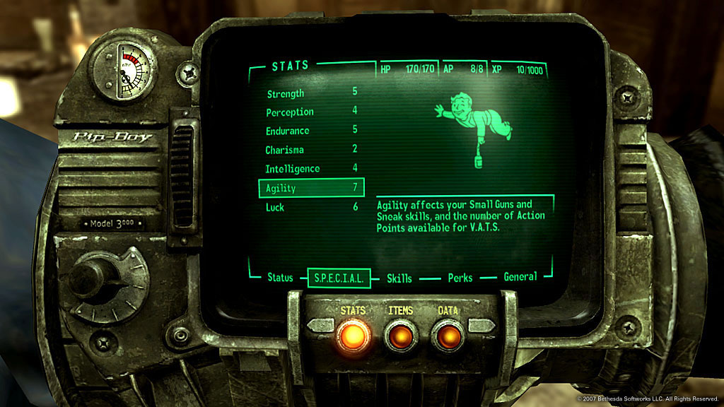
Fallout 3
The PipBoy is the heart of all of the Fallout franchise’s menus and, admittedly, it is a little clunky. There’s lots of scrolling up and down to find items, tabbing back and forth between various screens. It feels contextually relevant to the game world however, and it is incredibly iconic. Also impressive is that they managed to scale it all down to fit amongst that lovely, steampunk frame (which gives it some diegetic points as well - watch the radiation counter spike in a radiated area!).
Metroid Prime
If you’re playing an FPS game, the HUD should be a part of that first-person experience, no? As another diegetic example (I’m spotting a pattern here), I love how Metroid Prime puts the player in Samus Aran’s iconic helmet.
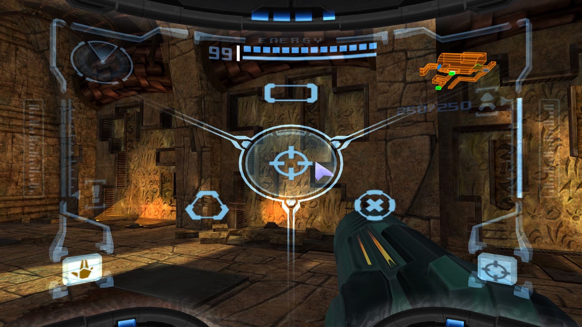
The HUD is clean and stylish, with transparent borders framing the action and UI elements kept on a minimal colour palette so as not to detract from the action. The HUD wraps around the visor, and important information is assigned to different areas of the screen - health on the top, remaining rocket on the right. Geographic displays sit in the top corners, whilst weapon and visor toggles take the bottom corners.
Maybe one day, if ever Nintendo branched into VR, we’d see Metroid Prime make a glorious return there. For now though, we can only hope more games emulate the structure of Prime’s HUD.
Megaman Battle Network
In retrospective, Megaman Battle Network was a pretty strange game. Combining a card-based battle system with RPG and RTS elements? Some would call it madness. Others would exclaim “genius!”.
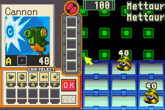
The main draw of the battle system was selecting Battle Chips, and using those against enemy Viruses. The Chip Select menu took over the player half of the screen, keeping remaining enemies in view, and allowing the player to develop a strategy whilst choosing their weapons.
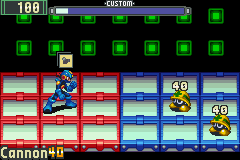
Once in battle, the UI minimised, letting the player focus on executing their strategy. In this streamlined view, health stayed in the top corner. Battle Chips were displayed in a stack above Megaman’s head, with the current weapon at the front, and the name in the bottom corner of the screen. A timer running along the top showed how much time until the player could select more Chips.
Now that I’ve dropped that nostalgia bomb, I really need to dig out my GameBoy Advance again…
Game UI has definitely grown more important to me in later years. Where once it could be seen as set dressing, now I see it as a pivotal piece of a game, and something I tend to play with from the start. Now I turn it over to you, dear reader. What’s your favourite interface? Tweet me at @LiteMorgan and let me know!